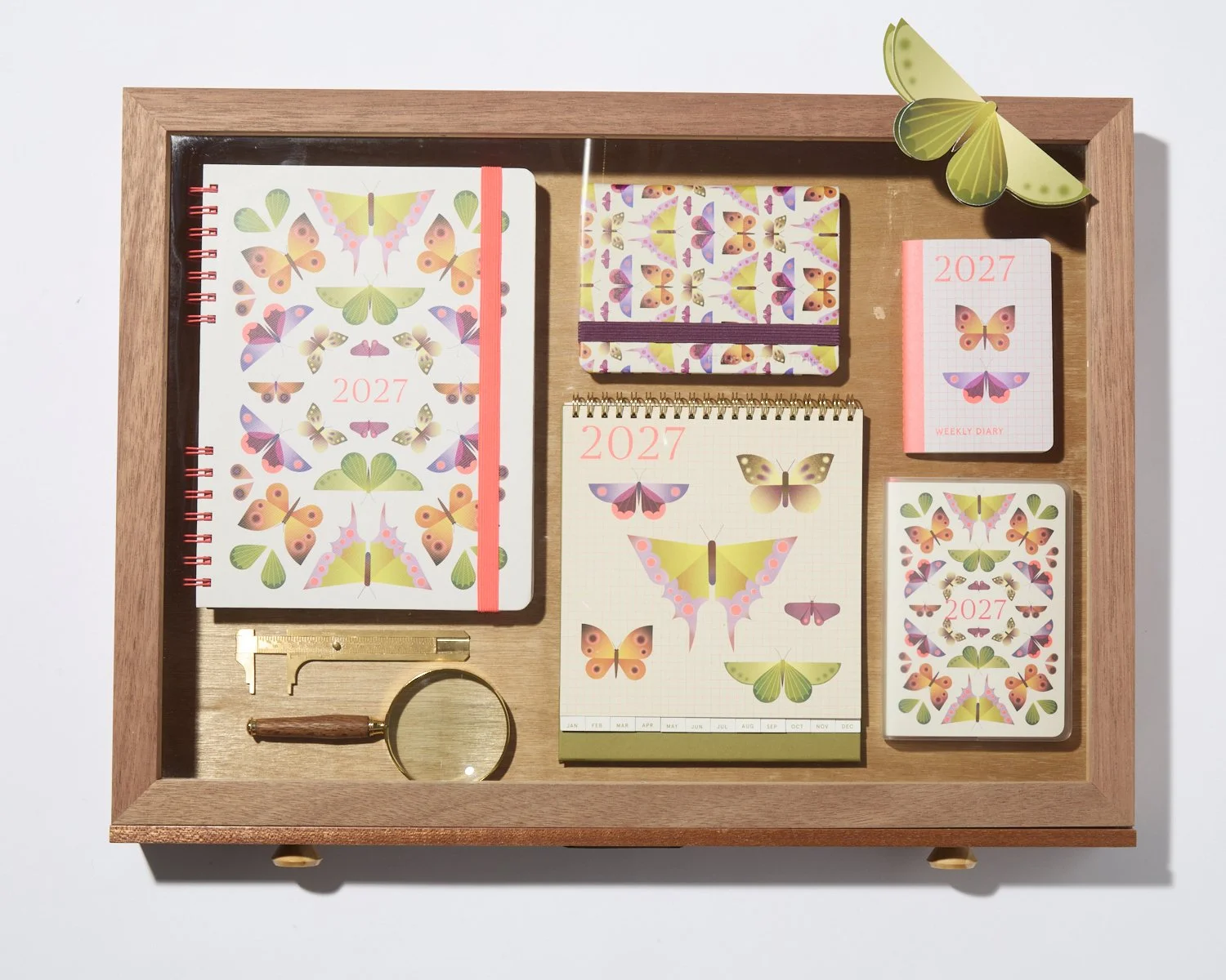
kikki.K x Australian Museum 2027 Dated Collection
Designing and delivering an annual product ecosystem across multiple formats, audiences and production requirements.
As the Graphic Designer and Illustrator for kikki.K’s x Australian Museum 2027 Dated collection, I worked closely with Creative Director Lisa Gorman to translate the creative direction for the season into a complete
range of diaries and calendars.
With hundreds of interconnected pages, multiple formats, materials and constructions, Dated is as much a systems-design challenge as it is a visual one. Every product needs to feel distinctly kikki.K while balancing illustration and personality with hierarchy, usability and the realities of manufacturing at scale.
My role covered the entire design and development process, from
original illustration, graphic design and internal page systems through to technical artwork, supplier liaison, sampling and production coordination. It meant thinking about the collection from the first sketch right through
to the finished product.
Graphic Design Illustration
Product Development Range Development Production Coordination
CASE STUDY – 001The Collection
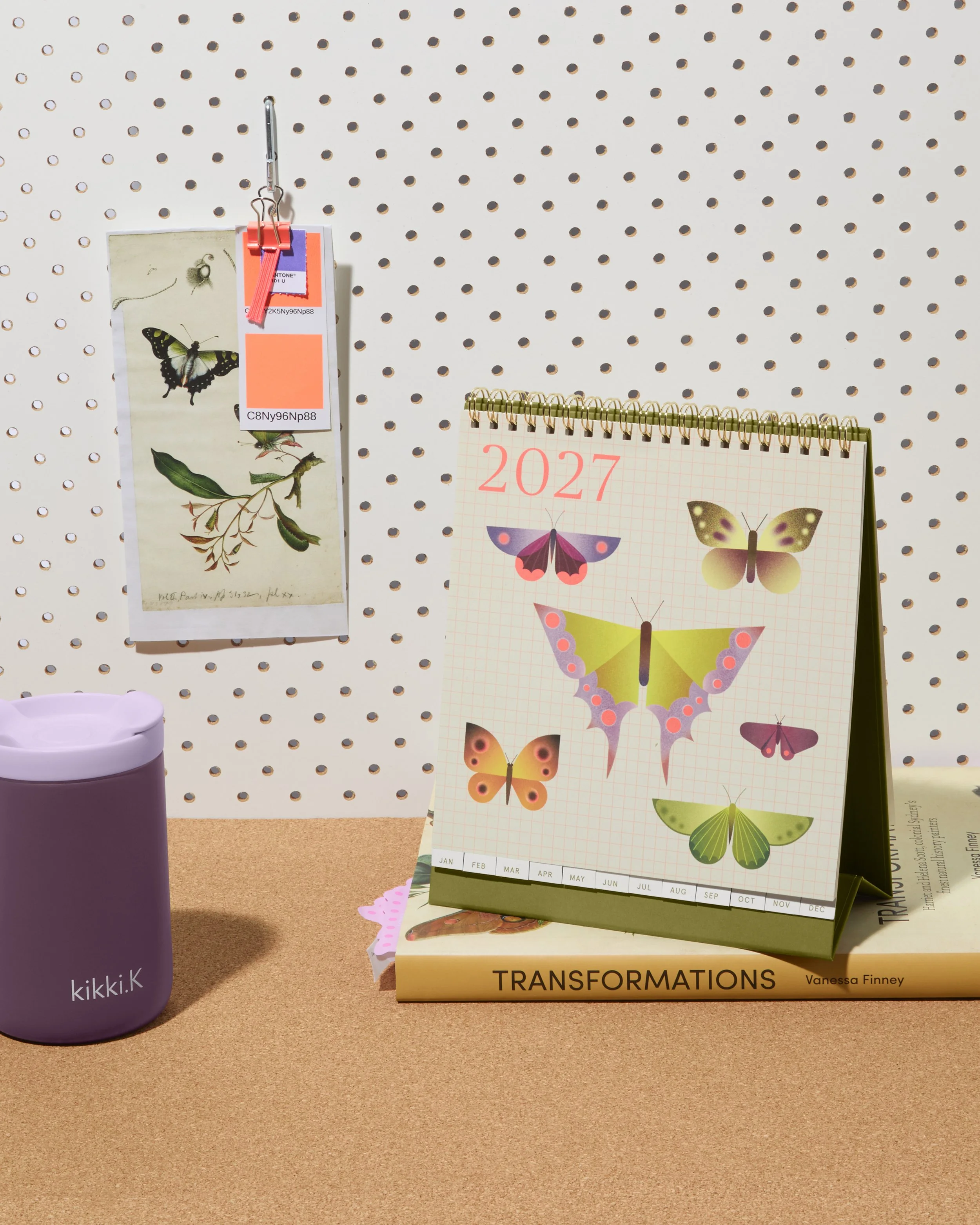
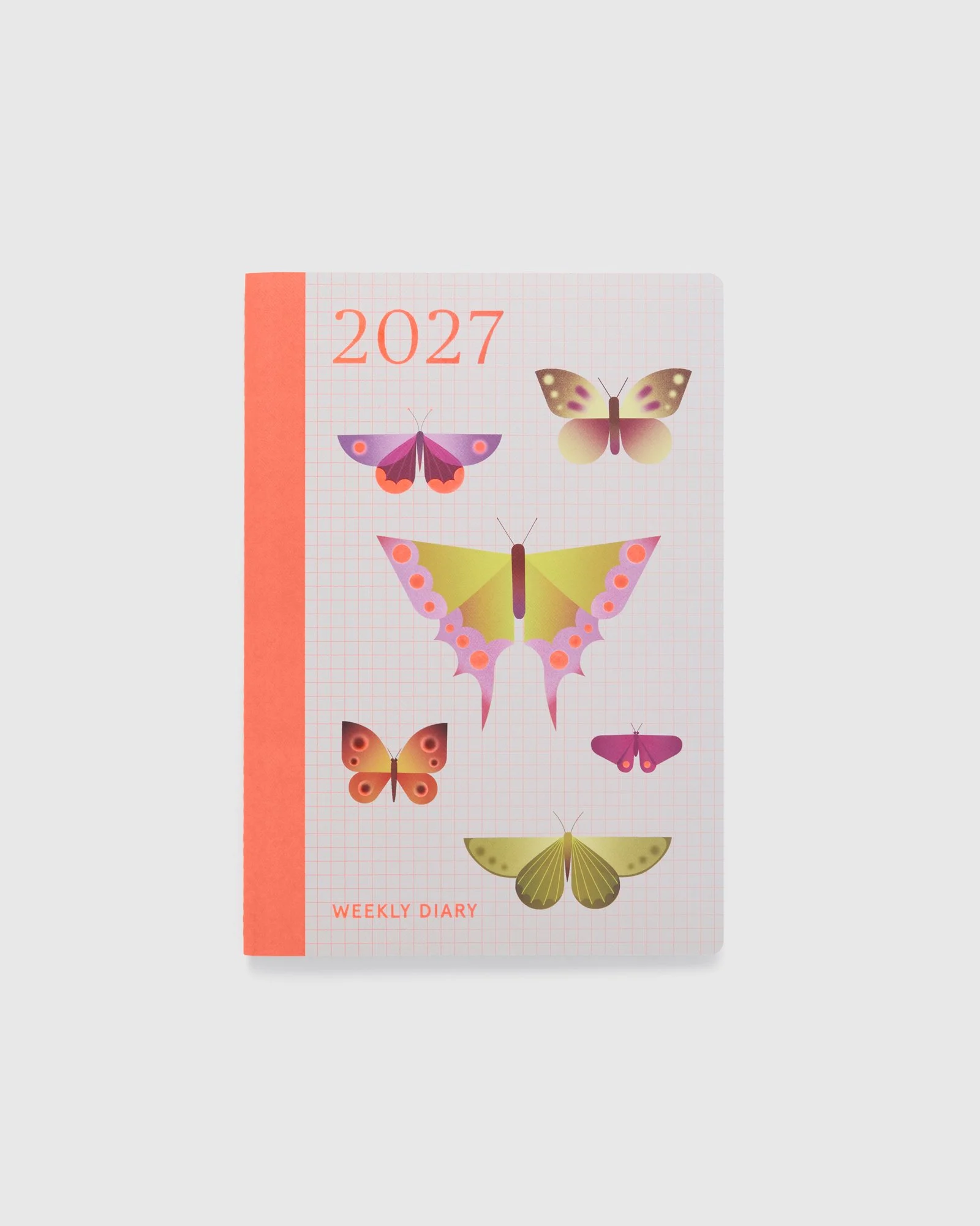
Dated is a huge range, and designing it means thinking about far more than what goes on the cover. I worked across the entire collection, from the original artwork and cover designs through to internal pages, calendars, layouts and all the small details that make each format feel like a kikki.K diary.
With so many different products in the range, one of the biggest challenges was making sure they all felt connected without simply repeating the same design over and over again. A tiny B7 diary has very different needs to an A4 diary or a wall calendar, so artwork, colour, scale and finishes all had to shift depending on the product while still feeling like they belonged to the same collection.
My role also continued long after the initial designs were finished. I prepared the technical artwork and specifications, worked directly with suppliers, reviewed samples, selected and refined colours, materials and finishes, and made changes as the products moved through development and production.
It’s a lot of moving pieces, which is what I love about designing Dated. The final collection needs to feel effortless and cohesive, even though behind it are hundreds of individual design decisions that all have to work together.
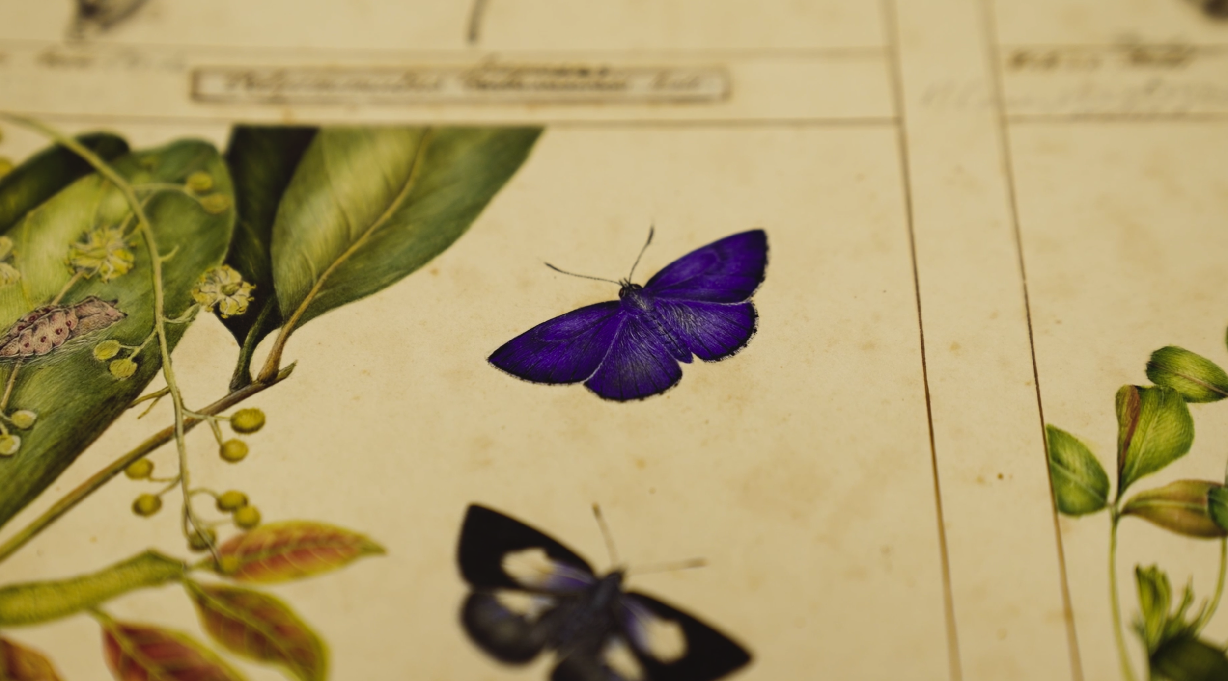
Warm, nature-led colours sit alongside brighter accents, while more ordered grid structures are balanced with expressive illustrations and unexpected colour combinations.
The result is a collection that moves between the precision of a museum archive and the colour and energy expected of kikki.K.
The Collaboration
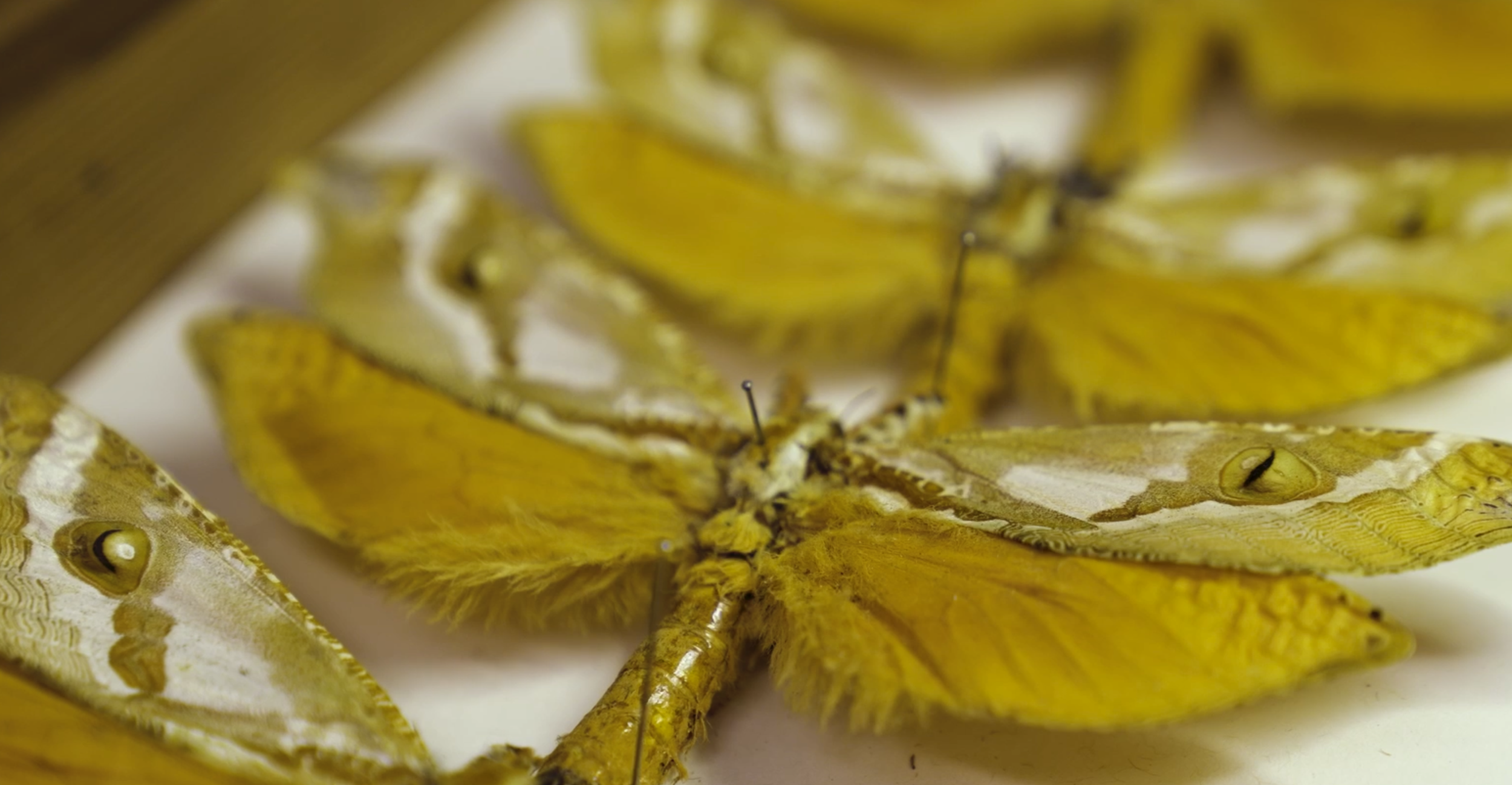
At the heart of the 2027 collection was a collaboration between kikki.K
and the Australian Museum, celebrating nineteenth-century natural history artists Harriet and Helena Scott, known for their beautifully
detailed studies of Australian flora, moths and butterflies.
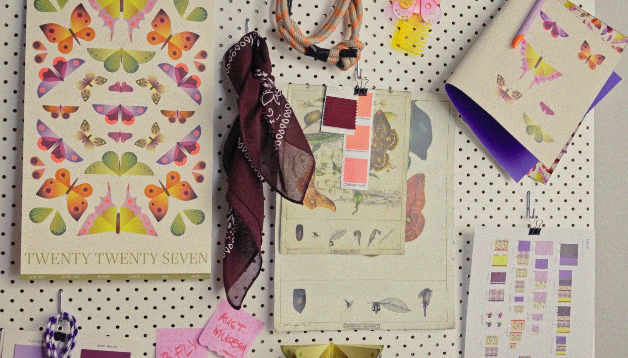
Working from Creative Director Lisa Gorman’s direction for the season, I translated this incredible archive into the visual world of Dated, exploring how the Scott sisters’ work could sit alongside original illustration, colour and pattern while still feeling distinctly kikki.K. The challenge was to respect the history of the artwork while giving it a fresh life across a contemporary collection.
From Archive to Collection
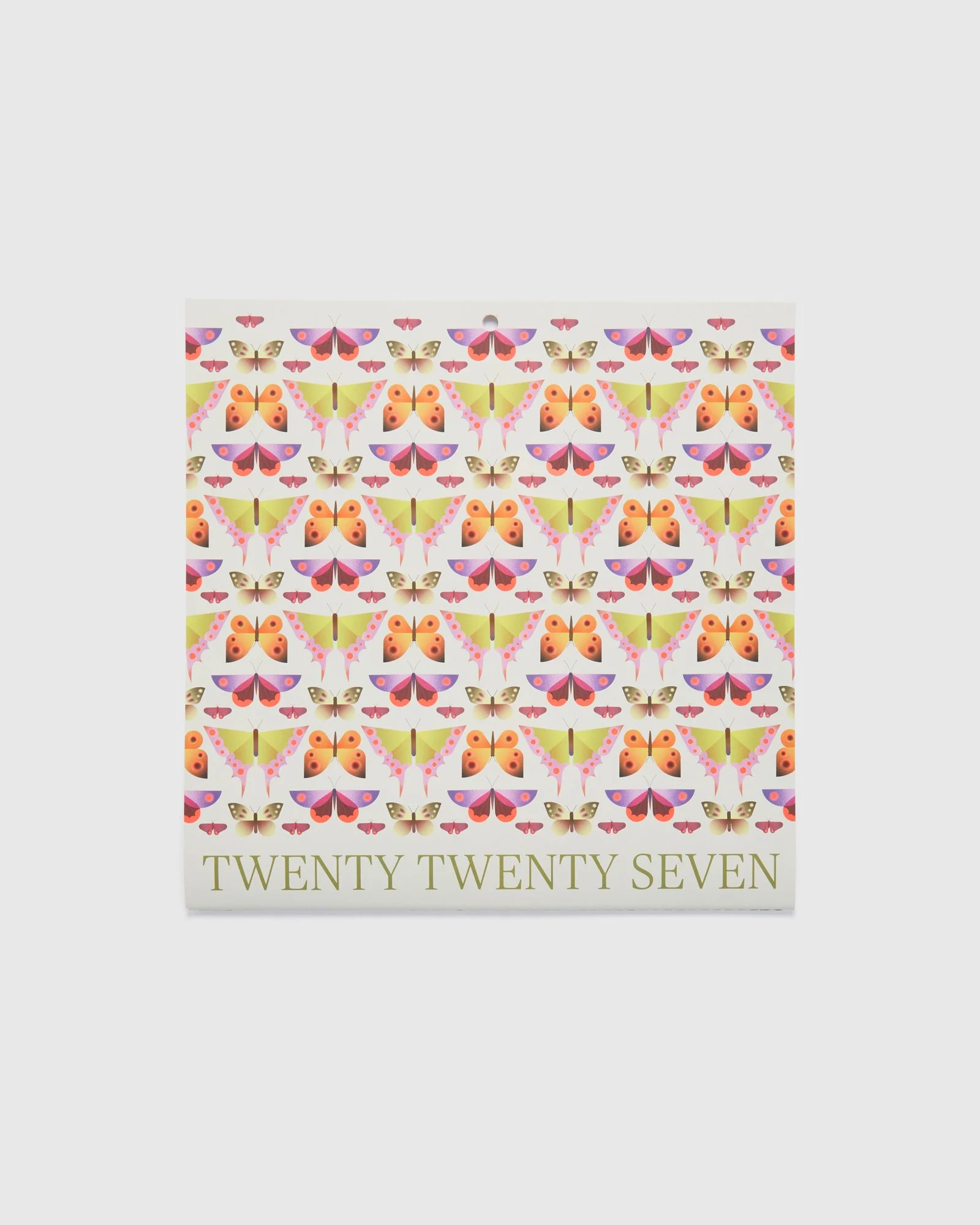
The collection developed around the colour, symmetry
and intricate pattern found in Australian moths and butterflies.
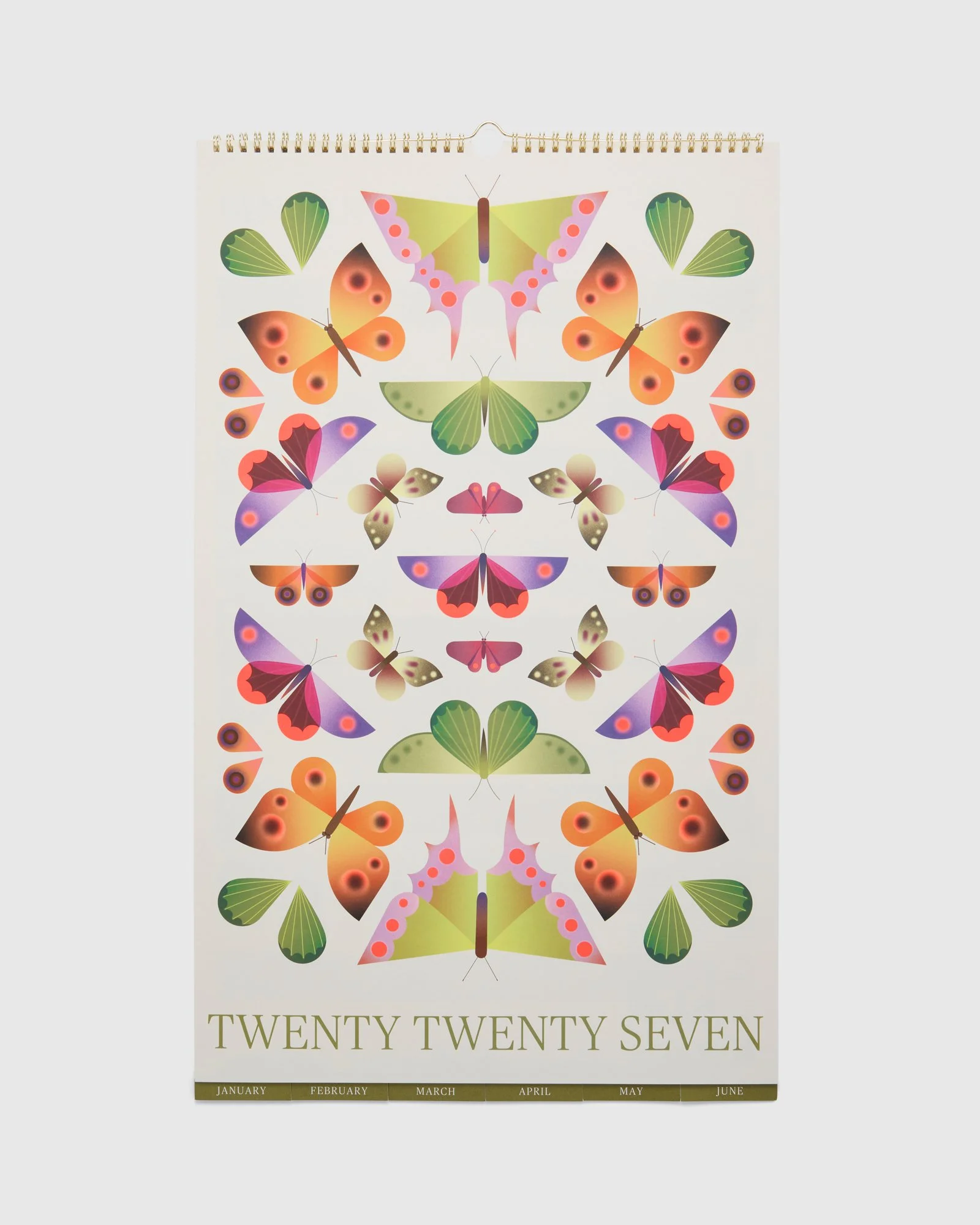
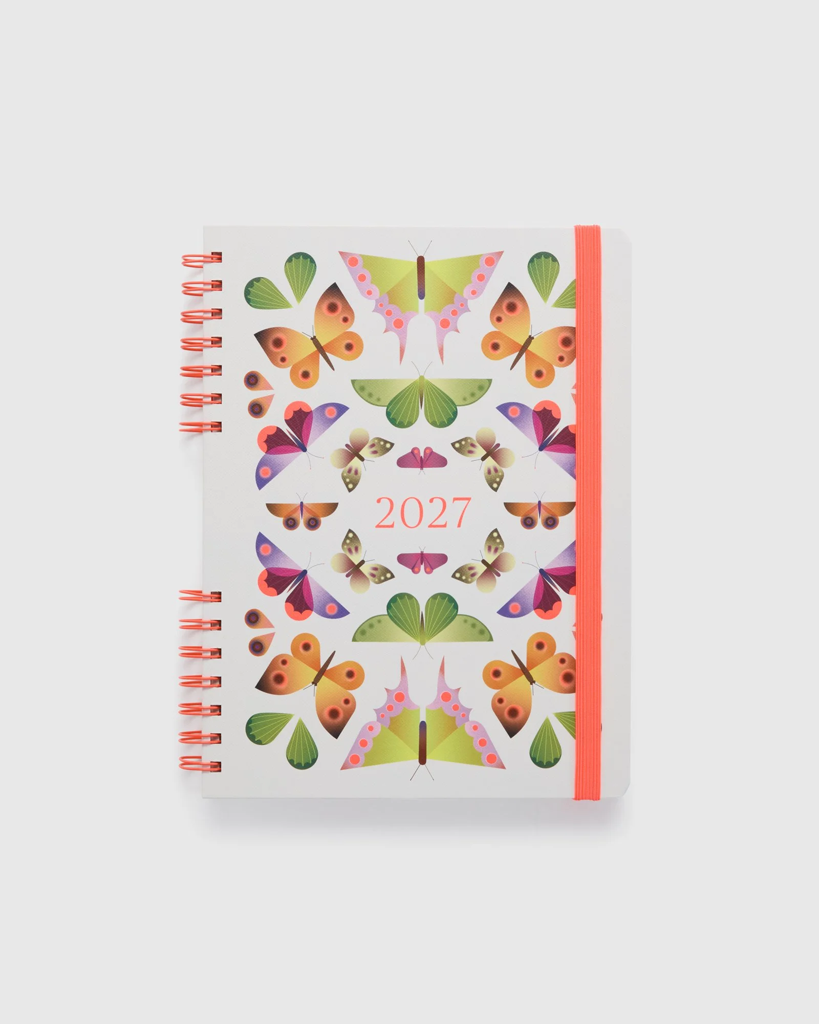
The hero print, Kaleidoscope, takes cues from the formal arrangement
of specimens within museum drawers, balanced against the much
more organic patterning found across butterfly and moth wings.
Rather than treating the archival material as a standalone feature,
I wanted that visual language to carry through the wider collection.
Scale, repetition, colour and composition became ways of creating variation while keeping the range connected.
Illustration scale, composition, colour and placement shift throughout the collection, creating moments of consistency without making every product feel identical. Those decisions continued inside the products, where typography, monthly colours, tabs, stickers, page layouts and feature artwork all became part of the same visual world.
Every detail needed to work individually, but also make sense when the collection was seen together.
Designing the Range
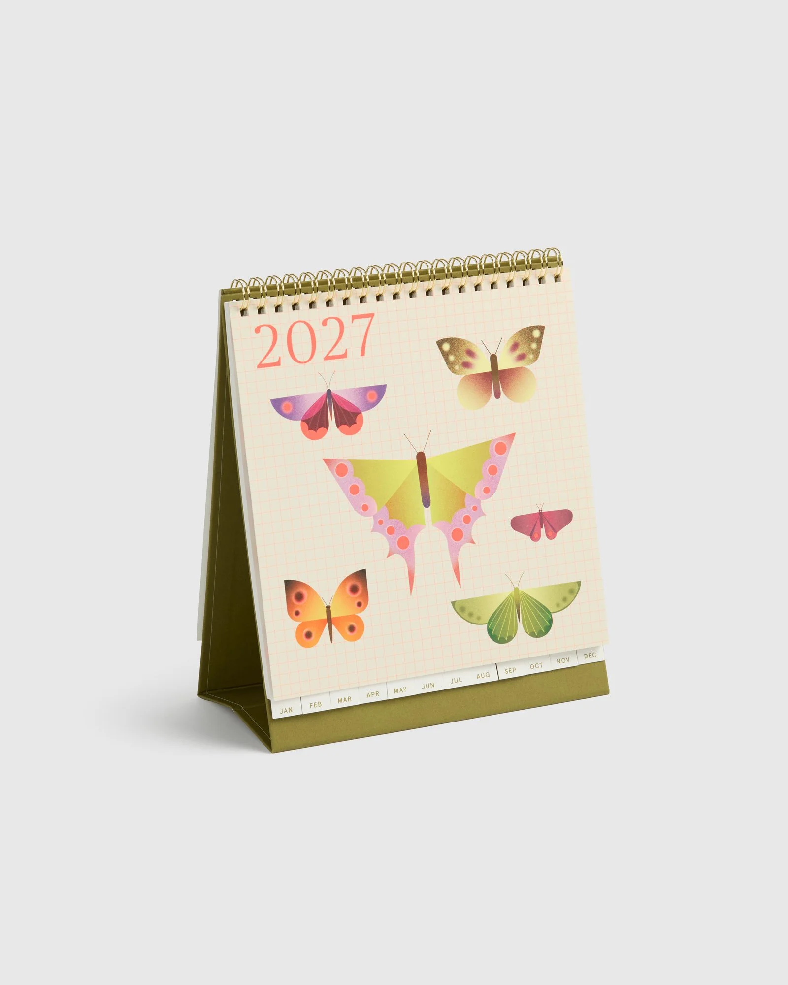
Designing an annual Dated collection means thinking beyond a single cover. The artwork needed to work across products ranging from compact B7 diaries through to A4 formats, daily and weekly layouts, household calendars and desk calendars, each with different dimensions, constructions and functional requirements.
I developed the graphics and artwork as a flexible visual system rather than simply repeating one design across every product.
Role
Graphic Designer / Illustrator / Product Developer
Scope
Graphic Design · Original Illustration · Product Design
Range Development · Internal Page Design
Print & Material Specification · Technical Artwork
Final Artwork · Supplier Liaison · Sampling & Revisions
Production Coordination
Creative Director
Lisa Gorman
Campaign & Photography Art Direction
Emily McBean
Brand
kikki.K
Collaboration
Australian Museum
Collection
Dated 2027
Designing for use
A diary has to do considerably more than look good on a shelf. Throughout the development process I considered how the visual design interacted with the practical purpose of each format: hierarchy, writing space, navigation, legibility
and the way somebody moves through the product over an entire year.
Weekly and daily diaries required different approaches to information and space. Calendar formats needed to work at a distance. Smaller products needed the same character as the larger formats without losing clarity.
This meant continually balancing illustration and colour with usability, allowing the artwork to give the collection its personality without competing with the reason the product exists in the first place.
From Screen to Shelf
Once the creative direction was established, I carried the designs through technical development and production. This included preparing final artwork and specifications, developing colour and material details, communicating with suppliers, reviewing samples and resolving the inevitable differences between something designed on screen and something manufactured at scale.
Different formats brought different production considerations, from recycled paper covers and sewn bindings to PU, PVC jackets, foiling, elastic closures, ribbons, wire binding and other finishes.
Samples were reviewed and refined throughout development, with adjustments made to colour, artwork placement, construction and finishing before final approval.
For me, this stage is as much a part of the design process as the initial concept. A product isn’t finished when the artwork is finished. It’s finished when the physical object works.
Made for the Everyday
Dated has a long history at kikki.K, with incredibly loyal customers who return to the same diary formats year after year. They know these products inside out, which means even the smallest details matter. Each new collection needs to feel fresh and exciting while holding onto the familiarity and functionality people come back for.
That thinking followed me through the entire 2027 range, from illustration and colour through to page hierarchy, navigation, writing space and the way each format works in everyday life. The final collection brings all of those decisions together across an extensive family of diaries and calendars, balancing something new with everything customers already know and love about kikki.K Dated.
For me, that’s what makes the range such an interesting design project. It isn’t just about creating something beautiful for the year ahead. It’s about understanding what people already value, knowing what can evolve, and designing something they’ll genuinely live with every day for the next twelve months.